Thursday, December 31, 2015

Dart scores for 2015

I read someplace that if you practice something for five minutes a day you should see improvement over time. This past year I put that to the test and played darts for five minutes almost every day. On Saturday I played a game of baseball and tracked those scores. In March I started playing two games to get a better sense of how I was going. I chose darts because there is basically no setup time required and it is easy to quantify improvement over time.

Too bad I was aiming at the 1
It took me a while to come up with a training routine that I felt comfortable with and seemed to produce results. I didn't want to just throw darts randomly or play the same game every night so I used several strategies throughout the year. At first I was just aiming for the 20 or the 3 and was happy when all of the darts hit the top half or bottom half of the board respectively. Over time I got more specific and aimed for different sections. At the end I was running through the numbers and wouldn't progress to the next number until I hit the target with at least one dart.

I also experimented with my stance to find the most comfortable position. This didn't take as long but it did seem to make a big difference in my improvement. Getting to the point where I was consistent with my throws was definitely a major part of the process.

Over time I definitely saw improvement. While I wouldn't say that I'm a very good dart player I am happy with what I have seen this year and I plan to keep practicing on a regular basis.  I probably won't make a point of playing five minutes every day, but I will try to get a few games in every week.

You can see a chart of my scores for the year here on Tableau.
Tracking dart scores for 2015

Thursday, November 26, 2015

Thanksgiving

I have had an interesting few weeks leading up to Thanksgiving this year. It's hard to believe while I'm sitting in the comfort of my father's house that only two weeks ago I was in Les Cayes Haiti on a mission trip with the Carlisle United Methodist church. That was my third trip to Haiti and every time I have been there it reminds me of how lucky I am to have grown up in a safe place with family and friends that care about me. We never had a lot of money growing up, but I can't remember ever really being hungry or going a day without a meal. The situation for the people we were working with in the small community of Deroche can't say the same. Having been there so recently makes Thanksgiving a little more poignant this year than it has been in the past.

The humility I felt from the trip was reinforced last week when several Tibetan Buddhist monks visited Dickinson College. They were there creating a sand mandala which is a process that involves intent concentration and patience. After spending most of a week on the project the sand is swept up and poured into moving water. It is amazing to see people spend so much time on something and then just sweep it away as if it were nothing. I believe that the exercise is meant to reinforce the Buddhist idea of impermanence and that we really shouldn't get attached to things of this world. As I would walk through the Library and see the monks at work I usually thought back to the people in Haiti that have so little to let go of in the first place. They probably don't need the lessons that a Buddhist monk would convey as much as I do, but I can't help but wonder how they would receive it anyway.

I feel like I could say so much more about this but the words just aren't coming out. I just hope that as we move into Christmas time I can hold on to these feelings of thankfulness and appreciation for what I have.

Thursday, October 15, 2015

PSBA Conference Day 2

Today was a shorter day at the conference but I still got a lot out of it.

The first session I attended was presented by several folks from Southern York County School District titled "Transforming Factory Schools into 21st Century Teaching and Learning Centers." They went through their process of implementing their one to one program starting with the question: What is the goal of education today? One common phrase that we hear a lot in education is that every student should make a year of growth every year. Central to SYC's mentality is that every student and every teacher should make a year of growth every year. Placing an emphasis on both students and teachers is important when you want to transform your school and they appear to be doing a great job at Southern York.

They showed us the first few minutes of a TedX talk by L. Todd Rose on the Myth of Average. The short version of the video (which is worth watching in its entirety) is that when we design for the average we aren't designing for anyone. This leads to customized learning when applied to schools and education. Before diving into a one to one program they ran two pilot groups with students. The 16 students first spent four weeks with iPads and then another four weeks with Chromebooks. After the evaluation the students chose the Chromebooks due to several factors, including the keyboard, ease of use and sharing and collaboration features. I asked about this after the talk because the collaboration can be done on iPads but the students felt that it just worked better on the Chromebooks. Students continued to have input into the program including on issues of policy which I feel is a great idea. The students also proposed setting up a student run tech support center which was implemented with the help of the Librarian and their IT staff. Along with these efforts that are student based Southern York is also making efforts to customize their faculty learning processes in order to help them make yearly progress, too. Overall I was very impressed with the presentation and took a lot away from it.

The next presentation was "Evaluating and Assessing your Digital Learning Initiatives" presented by
Randy Ziegenfuss and Lynn Fuini-Hetten from Salisbury Township School District. This was also a very well put together presentation on Salisbury's efforts on digital learning and it is obvious that this district has put a lot of time and energy into their initiatives. They were sharing with us how to run through the entire process of creating and evaluating an initiative from concept to implementation to data collection and evaluating that data. One of the most wonderful things they have done is made all of their work available online at www.tl2020.org. They did not focus on the particular technologies used in their district but instead talked about methodology and process, which was great.

The third talk of the day was "Examining the PA School Performance Profile" by Dr. Ed Fuller from Penn State. Dr. Fuller runs the Center for Evaluation and Education Policy Analysis and shared his research on school performance profiles and systems like PVAAS. He has found that the best correlation between schools and SPP scores is rooted in poverty rates and little else. The implications of this are that poor schools receive poor SPP scores and their funding is affected adversely because of this. The result is that their funding gets reduced, which lowers their scores and begins a downward spiral or poorer and poorer results. His research was interesting but unfortunately his message isn't being heard very well by those making decisions in Harrisburg.
The only session tomorrow is the closing remarks which are being given by Robert Fulghum. I'm looking forward to hearing him speak and I'm also already thinking about next year's conference and getting more involved with PSBA. There is so much to learn as a school board member and I don't think we should be left out of the equation of making a year of progress every year, either.

Wednesday, October 14, 2015

PSBA Conference Day 1

I'm attending the Pennsylvania School Board Association Leadership Conference for the first time this year which started today. I have been to my fair share of professional conferences before but I still wasn't sure what to expect from a conference like this. While being on the school board is a voluntary position the conference is also for school administrators as it is also hosted by the Pennsylvania Association of School Administrators. This means that it is a professional conference for folks like superintendents, assistant superintendents and intermediate unit executives. This makes for an interesting mix of folks that have a lot of experience in the K-12 education space and others of us that happened to get elected to be their bosses. I don't know about other board members but sometimes the things we talk about take a while to digest and I know that I have a lot to learn about which is one of the reasons that I decided to attend the conference.

The opening keynote was given by Dr. Heidi Grant Halverson on the topic of a Get Better Mindset. Dr. Halverson spoke about the difference between a "Be Good" mindset where we are judged based on comparisons to others and a "Get Better" mindset where we are judged against ourselves. The latter encourages self improvement and working through difficult situations. Other benefits include being more willing to innovate even with the possibility of failure.
(Tweet from Dr. Hotchkiss, the Bermudian Springs Superintendent)

Dr. Halverson cited a lot of research to support her assertions and if you are interested I highly recommend that you explore her work further.

The second session I attended was given by Dr. James P. Capolupo titled "Behind the Curtain: Tackling the Myths and Mysteries of the School Superintendent Position." His talk was divided into things you should try and things you shouldn't try. Thankfully our superintendent already does most of the things Dr. Capolupo recommends and the things that he recommended not doing but we do anyway come down to cultural differences between where he was a superintendent and Bermudian Springs.

After lunch I attended "Augmenting Reality with Aurasma: Bringing Objects to Life" presented by several teachers from the North Hills School District. Unfortunately it took them more than half an hour to get to the promised demonstration of the Aurasma app, but the talk was still very good. They have their 8th grade social studies classes create multimedia projects for each section of the class before the exam. This allows the students to demonstrate their knowledge and gives the teachers the ability to correct any misunderstandings before the exam takes place. The students create these projects using various apps on iPads which also gives them tools to express their creativity. Some of my favorite examples from the presentation include making stop motion movies to talk about the Jamestown Settlement and using an app called Book Creator to create iBooks compatible books that describe the Declaration of Independence to a 3rd grader. The Aurasma app was used to place augmented reality pictures around the school that gave information about Presidents and how they are like Sesame Street characters.

The last session of the day was presented by Blanca Duarte from LogicWing. She spoke about the concept of deep learning and how schools can use technology to encourage it in our schools. Her presentation included several small group activities which yielded interesting conversation with other school board members. One of the most important things that I gleaned from this talk was pointers to resources from Intel on using technology in education, including Intel Teach Elements which is a series of modules that teachers can use free of charge. I also learned that Intel has an Education division which provides consulting services on how schools can incorporate technology into their curriculum.

Between sessions I also visited the exhibit hall and had several good conversations with various vendors. Interestingly I found myself wearing my Dickinson College User Services hat and checking out technologies that might be useful for our environment there.

Day one of the conference was a good experience and I'm looking forward to day two.

Wednesday, August 19, 2015

Bermudian Springs SAT scores over time

Here's another example of some work I did learning Tableau. This shows the SAT scores for Bermudian Springs over time. The formatting in Blogger makes this difficult to view, so you might be better off viewing it at Tableau Public.

Monday, April 06, 2015

Learning Tableau for data visualization

Tableau is a software package used for data visualization. I have heard of it before and it came up again as part of the Emerging Technologies Working Group that I am leading at work. Normally I'm the kind of person that needs a practical reason to learn a software tool and until recently I didn't have any data visualization needs so Tableau was kind of on the back burner. A few weeks ago, however, I started to have some questions about Supreme Court decisions and decided I would try to answer my questions using Tableau. My question is whether there have been more cases decided recently with a five vote majority opinion than in years past.

Step 1: Getting the data
The first step to answering my question is getting access to data on Supreme Court cases. I checked the website for the Supreme Court and while they do have data on decisions available I did not find an easily exportable list of what I was hoping to visualize. After some web searching I found the Supreme Court Database and it has exactly what I need. The Supreme Court Database has a dataset of decisions from the 1946 through 2013 terms which includes a ton of information regarding all cases brought before the court. They offer this data as a CSV download in several different formats. I chose to download case centered data organized by court citation. Since I am not well versed in the workings of the court it is possible that this isn't the best dataset to use, but for the purposes of learning the software it was sufficient.

Step 2: Getting the software
Tableau offers a 30 day trial of their desktop software so I downloaded it and got started. They also offer a web based version but I wanted to experiment with the desktop version more.

Step 3: Creating a new workbook and adding data
Tableau is similar to Excel in that you have workbooks that contain data and graphs. When you create a new workbook the first thing you need to do is add data. Unlike Excel you need to connect to a datasource which can be something as simple as a file or as complex as a database server. My data is in a CSV file so I directed Tableau to connect to the file I downloaded from the Supreme Court Database.

Tableau classifies information in the data as either a Dimension or a Measure. Basically dimensions a are headers (text, dates, etc.) and measures are axes on a graph (numbers).

Step 4: Creating my first graph
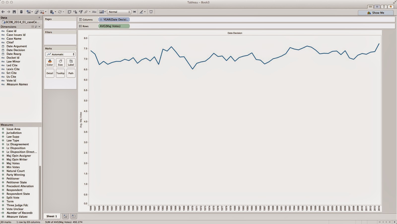
Once Tableau is connected to your data you can create a worksheet. Tableau's interface gives you the ability to setup rows and columns for creating either tables or graphs. Since I was interested in votes over time I used the "Date Decision" dimension for my column and the "Maj Votes" measure as my rows. Tableau defaults to calculate the sum of majority votes which really isn't useful, so I switched this to the average which provides a little more information.

This graph shows the average majority vote per year. If there were more cases being decided with a five vote majority then this graph should show the average vote approaching five over time. As you can see, that is not clearly the case. And in fact, if you turn on trend lines (Analysis, Trend Lines, Show Trend Lines) Tableau shows that the average majority vote count is going up per year, and not down. 

But what if I wanted a graph showing the number of cases decided by five votes per year? This is a different graph that requires counting majority votes but only those that have a value equal to five. I created a new worksheet with "Date Decision" as my column and "Maj Votes" as my rows, but this time I asked Tableau to show the Count of "Maj Votes". This graph should show the number of dockets before the court each year since each docket has a number in the "Maj Votes" column of the data. Next I dragged the "Maj Votes" measure into the Filters pane to apply a filter to the data. I filtered for a range of values between five and five and turned on Trend Lines to generate the following graph:

So, it looks like the number of cases decided by five votes is not increasing over time. 

There is a major issue with my data and conclusion, however. I am simply counting the number of cases decided by five votes and not the percentage of cases. My graphs don't include the total number of cases, so my conclusion may not be accurate. Tableau does include functionality to create calculated fields but I haven't figured that out, yet. Stay tuned to see if my initial graphs were misleading or not.


Friday, March 27, 2015

Converting files from Google Drive to Microsoft OneDrive (Office365)

I'm a huge Google person and use their services for most of my personal needs (email, blogging, video sharing, etc.). I have been using Google Drive and the Docs and Sheets apps for my word processing and other needs for several years and in general have been very happy with the performance and improvements they have made. At both work and school it is great to have access to my documents wherever I am and on whatever device I'm using at the time.

That being said, Microsoft is also making huge pushes into cloud computing and their Office365 offering is now fairly stable and mature. Dickinson College (where I work) has recently been moving towards official support for these services as they are now included in our Microsoft Campus license agreement. In order to help acquaint myself with the services I have been making an effort to use them more frequently and one of the first things I wanted to do was make a copy of my Google Drive "Work" folder on Microsoft's OneDrive service. Since my computer is now setup to sync to both services this shouldn't be difficult, however, Google's file formats are really just pointers to the web services, so the files need to be converted to Office formats for this to really work.

There are two ways to handle this conversion, one way would take a very long time, depending on the number of files you have, and the other will save you a ton of time. I'm going to document both here for reference, but if you are making a similar transition then the second method is the one you should use.

Converting a Google Docs file to Office

  1. Open the file you want to convert in Google Docs.
  2. Click File, Download As, Microsoft Word (.docx).
    Note that if you are working with a spreadsheet you will get the option to save as Microsoft Excel (.xlsx) instead.
  3. The converted file will download.
You can use this process to convert files one at a time and this can be useful when you need to share a file with someone and they need it in Word or another format. This function is also useful for creating PDF versions of documents to distribute.


Converting an entire folder at once
Google will allow you to convert multiple files at once and this will be more helpful for making a wholesale transition from Drive to another service. 

  1. Login to Google Drive.
  2. Highlight the folder containing the files you want to convert.
    Note that you can select multiple files and folders by holding in the Ctrl key on a Windows machine and the Command key on a MacOS machine and clicking the subsequent files.
  3. Click the three dots in the upper right corner below the Google bar.
  4. Click Download.
  5. Google will prepare a zip file containing all of your files. Docs will be converted to Word format (.docx) and Sheets will be converted to Excel (.xlsx).
  6. Open the zip file and extract your converted documents. These can now be placed in your OneDrive folder or anyplace else that you want to store them.